Thursday, November 18, 2010

Because we all have sooo much free time...

My most recent newsletter from GIS Lounge contained a link to a free ArcGIS game, Fifteen.  Just in case you don't remember this game:


That's right.  It's that game we got as a stocking stuffer when we were 9 years old.  Remember getting frustrated at the puzzle and trying to pry the squares off of it so that we could just get the stupid "12" in the right place?  And then that jerk from social studies class solved it in like a minute and you felt like an idiot?

Hey.  Everything just went black and I woke up in my happy place.  Sorry about that... now where was I?

Right.  Fifteen.  Well, someone has created an ArcGIS version of the game.  Just download it, and "Fifteen" will appear as a toolbar option the next time you open an ArcGIS project.  Observe.


Hey!  What happened to Philly?

Enjoy!

Thursday, November 11, 2010

ESRI Conference at PSU

So, last week, just before I caught the plague, I was lucky enough to attend the ArcGIS 10 user conference held on the Penn State main campus.  We arrived fashionably late, sat in the back of the ballroom, and were therefore first in line for the buffet.  I became violently ill that very evening, so I would like to take this opportunity to publicly apologize to the 150 people who touched the salad tongs after me.  Also, so sorry for anyone who voted at the far left voting booth at the Penn Township Municipal Building after 4pm.  Ahem.

There was no name tag printed for me, and I have to say, my one regret about the day is that I lacked the courage to steal another person's name tag.  Said person registered for the conference and did not show up.  Said person was named "JingJing Wang".  Holy God.  I think JingJing Wang was too busy being awesome to attend.  And so nameless, I attended the conference.  Damn.  I can't believe I was too chicken to become JingJing Wang.  I guess I'm not ready to be that awesome.

Really, the main thing that I got from the conference, to distill down to a nice blog-bite, is that ArcGIS Online is pretty freaking rad.  Sure, it's no ArcGIS 10, or anything, but then again it's free.  Just make an account (I am ArnoldJudasRimmer*, because I am a colossal geek) and you can make, post, share, and edit maps online.  For FREE.


View Larger Map

Above is a super simple map of my old neighborhood with a subway overlay that took me about 2 minutes to make.  Just zoom to location, add basemaps (same ones we use with ArcGIS 10) and any layers you would like to add, from ArcGIS Online or elsewhere.  Simple and easy to share.  I'd really recommend starting an account and playing around with the website.  It's pretty nice.

And you can also make presentations.  Here is a particularly nice one by "bszukalski" showing more of what can be done using ArcGIS Online.

View Larger Map, click "Start Presentation" to view


*
Lister and Rimmer
"It's cold outside, there's no kind of atmosphere..."

Tuesday, November 9, 2010

If I've learned nothing else from this course, it's that Mercator sucks out loud.

Stop.  Using.  Mercator projections.  Just stop.

Because this is not getting old anytime soon, here is a great illustration that was linked on one of my very favorite sites, FlowingData.com.  Kai Krause has taken a goodly part of the world and superimposed it onto Africa, with very little overhang, just to make the point that Africa is freaking huge.  Observe.

yes, it is that large.  Click to make even larger.

By country, if you prefer.  Click to enlarge

The linked blog above, which I cropped these images out of, has a nice sidebar with actual country sizes, just in case you want to look them up.

FlowingData makes a point of showing the GoogleMaps Mercator projection to show how ridiculously inaccurate it is. I found a really lovely satellite image of Earth in standard Mercator projection (really lovely.  just like all those cheesy PSAs around Earth Day say- it is an amazingly beautiful planet.  Jersey notwithstanding.) and cut-and-pasted roughly similar-sized rectangles side-by-side of Greenland, Africa, and much of North America.  Behold.

Greenland:  "Where is your God now, mortal?"
I, for one, would like to welcome our new overlords from the far North.  Herring for everyone!

Looking at the true size of Africa, can one really wonder why all those pasty-skinned Europeans ever looked south and thought, surely they can't be using all that land, can they? * 


*Kidding, kidding, colonialism was bad.  Especially for Congo.  Damn.


Saturday, November 6, 2010

Olympic Medals Assignment

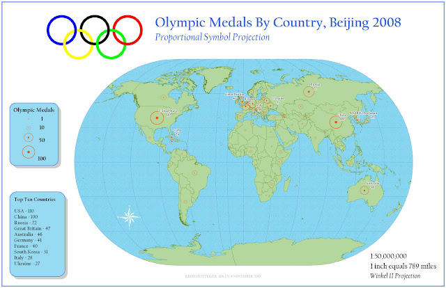
Here is my map for the Olympic assignment, click to enlarge

Well.  We were given the assignment to make a map using a proportional symbol scheme to show which countries won the most Olympic medals at the Beijing 2008 games.  Simple enough.  Almost too simple.  I have to say, I am not crazy about my map.  I kind of phoned this one in.  And don't worry, I would also tell that to my professor (who, BTW, reads our blogs) so this is not something I would not say in class.  My map is okay.  But merely okay.  It is not superlative.  However, I have been sick as a dog this week (I even missed class, which by and large Does Not Happen) and this was the best effort I could muster.  I then went home and slept for ten hours.  

So.  Why all the bitching?  Well, I've decided to present this as a post-mortem, and to detail what went wrong and what could have been better.  Including one detail that I will attempt to fix really fast before class.  Really fast.

What I don't like:

  • My medal symbol.  I attempted to import a really nifty image:

Click to enlarge, here is the original
But I had to take it into GIMP and remove the background (which took goddamn forever), and then when I imported into ArcGIS as a PNG for some damn reason, I wound up with a pixelated, yellow-toned, piece of crap.  Eventually I said F--- This and decided to make my own damn symbol, even if it looked less awesome.  So I made a hollow circle to have a sense of openness in the event of overlap but with a center dot to give a notion of placement, so that you wouldn't think that say, Austria's symbol was over Hungary.  I chose orange because... it showed up nicely.


  • Wow.  There is a lot of damn white on that map.  I would have liked to tone it down by giving it a slightly toned background, like a beigey shade... But my Olympic ring symbol, which I de-backgrounded in PP, decided to import in with a damn white background.  I decided that I couldn't deal with the sinus headache anymore, and just kept a white background.


  • The text in the bottom right should be smaller.  I honestly had trouble keeping track of the actual size of my text, as this map is drafted to be 22x34.  I may touch that up before class.  Maybe.


  • The north arrow does not curve into the side of the earth.  I just stuck it there.  Hrm.


  • The projection (Winkel II:  The Quickening) that I chose I liked initially for the pleasing shape that it gave the Earth.  However, looking at my map, I feel like my data is sort of not front and center.  Does my viewer have to squint and sort out which are the top medal winners?  I almost feel I should have chosen a scheme that unfairly emphasized the Northern Hemisphere to hype up my data.  Sorry, Southern Hemisphere.  First colonialism and now this.


  • Hey!  Let's all look at Antarctica!  There sure is a lot of it, doing f---ing nothing and taking up valuable real estate.


  • So I inserted a little box to show the top 10 medal winners.  Pretty much because my map is really bare and dull.  And later, when I look at my map, I think, where the hell is Germany?  Oh, GD ArcGIS ate my label with an overlap.  While I'm sure the French are glad to have some payback for WWII, I'm not too happy about my label.  I'm going to try and fix that Monday.


  • I made the dick move of deciding to only label countries that scored in excess of 20 medals, in the interest of not cluttering my map.  My apologies to Africa, South America, and Oceania.  Oh, and to Palau, partly because of my map but mostly because of global warming.


  • The projection is a little silly, in the way that all projections are silly, because it is inherently false while attempting to be realistic.  Sure, let's be all forward thinking and project the world in a round-ish shape... and then be all fake and cram all the continents to the front in a way that, God willing, they will never be.  Looking at the earth that way reminds me of the way actors sit at a table in a television show or staged play, all crammed together but avoiding one side, in order to all be visible to the audience at once.  Real people don't eat dinner that way.  Real continents don't look that way.  But, well, artifice it is.


  • ***************UPDATE************************
    It's twenty minutes to class.  I came in early and fixed/triaged my map.  Here it is.  Of course, I sit next to Foram and am in despair at seeing how f---ing awesome her map is.  Well.  My map is below.

    well, it's done, anyway.