Sunday, September 26, 2010

Fun with Stereotypes!

I found some hilarious stereotype maps on a design blog called "Mapping Stereotypes" by Yanko Tsvetkov, specifically, Europe as seen from various points of view.  Obviously, these are not meant to be taken seriously.  (FlowingData actually described these as "stereotypes of stereotypes" which captures these pretty well.)  Enjoy and have a good laugh... we're probably all a little frazzled from hastily compiling our Yellowstone projects (no, of course, Nicole, we've all been done for weeks now!).  As always, click to enlarge-- you will need to do so in order to read some of the smaller captions.

Europe According to the US:


I for one, cannot wait to tell my best friend in Bosnia that she is labelled "Resident Evil".


Europe from the UK perspective:


Finally, God help us all, Europe as seen by Gay Men:
Solely because the label of Italy as "Straight Homos" made me literally laugh out loud.


Along similar lines, I also found a really funny youtube video depicting Europe as seen by Estonians.  The crude illustration style and faux-amateur narration really only makes it funnier.  I don't want to say anything else, and spoil any punchlines. Have a look.

Saturday, September 25, 2010

The Psychology of Cartography

Since embarking on my GIS studies, I have encountered a number of map enthusiast websites (StrangeMaps, FlowingData, MapOfStrange) as well as map-enthusiast books (just bought this one, and really enjoying it), and have found that my own nascent map-geekery consciousness has been awakened.  I always had a sort of fondness for maps (not to mention an eerie ability to fold them properly, and an associated contempt for those who can/do not), which has become a full-blown mania.  Finding a number of people who are self-described "map geeks" has made me wonder about the psychological effect of maps.


I find that in myself-- and I cannot, at least in this regard, believe that I am unique-- the presence of maps results in a sense of comfort, of control, of protection from the Unknown.  Maps allow us to become godlike, to view the whole of our landscape from a dispassionate birds-eye perspective, above the fray, above the struggle and morass of crowded cities and hostile wilderness alike.  Even the terrifying creatures depicted on the edges of the map (Here be dragons!) suggest by comparison that safety is augured within the plotted territory.  The only true danger lies in the unexplored realms.


We all know, things only really went bad once Mike threw away the map.
This country girl, for one, was more upset that they crossed the stream, and did not follow it.


Following a rather painful series of trials in my life, some years ago, I found myself coping by becoming immersed in mathematics, specifically actuarial statistics, a far cry from the artistic world in which I had been involved.  If I could only reduce life's passions, tribulations, and tragedies to discrete points of data, if I could reduce that data to an equation, maybe I could find a sort of balance in chaos.  Of course, it was a fool's errand, if an enjoyable one.  Now I find myself immersed in a world of maps, of cartography, of dispassionate analysis.  While I was brought to this program by the sensible notion of learning a marketable skill, I have to wonder if I am also attempting to once again find reason and order within the uncharted.  Are indeed, we all-- do cartographers think of themselves as somehow lost?

Sunday, September 19, 2010

Maps, Bias, South America, and Buckminster Fuller

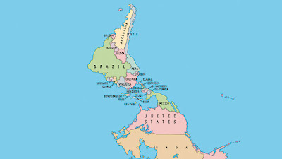
The cover of this week's issue of The Economist Magazine features a story on Latin America with the title "Nobody's Backyard".  The cover illustration is an upside-down map, centered on South and Central America:


From economist.com, click to enlarge


I've always enjoyed these types of (to a northern-centric audience) unconventional maps, starting from when I was in middle school and a teacher showed us an upside-down map.  At first it felt "wrong" but the older I got, the more I realized there is no "right", only bias.  As annoying as it is, it's important and correct to analyse one's own biases in order to seek greater truth.  "North" is, once you think about it, a type of bias.  "North" only applies on Earth, and each separate sphere has its own "north", governed by its own magnetic field.  And the fact that the most of the major planets (minus Pluto, of course, and Uranus, which has a tipped axis) in our own solar system share a more-or-less similar orientation of magnetic north is less to do with any sort of "right" or "correct" way and more to do with the fact that we all coalesced from the same sort of spinning plate of matter.  The direction of the spin transferred to the spin of each planet which in turn produces a magnetic field.

Science!


ahem.

I thought I was pretty damn clever for my musings on the agreed-upon fiction of a "north" (much like our agreed-upon fiction of "the value of cash") until I found out that Buckminster Fuller felt the same way, and so devised his own projection called a dymaxion map.  The important thing to note here is that there is no "correct orientation".  Rad.

taken from this site, click to enlarge


That said, I shouldn't be surprised that Buckminster Fuller would have done such a thing.  He's fantastic.  He's forward thinking.

we wear the same glasses!


Getting back to the original point of this post, that is, using an unconventional map to subvert cultural bias, not only is South America marginalized, as it were, by the typical use of a north-up projection, but it is also marginalized by use of a standard Mercator projection.  The same map that we all stared at as schoolchildren, gaining a perspective on the world outside of central PA, as pointed out in our textbook, is well-known for exaggerating land mass the further from the equator one travels.  Since most land mass in the northern hemisphere is massed higher up on the globe ('higher up'?  see-- I just did it!) and most land mass on the southern hemisphere is closer to the equator, a Mercator projection bulks up the north at the expense of the south.  Maybe this wouldn't be such a big deal if the history of Latin America didn't contain so many examples of Northern/European colonial oppression.  I'm not sure if the artistic editors of the Economist really took 1) the shape of the earth, 2) the distortion of typical projections, 3) the colonial history of South and Central America,  and 4) Buckminster Fuller and Hilary Swank, into account when they set this cover for "Nobody's Backyard" but it certainly seems to have been a canny decision.

On the same stroll through my bookstore, I came upon another (!!) fantastic South-American themed design:

published by Bloomsbury


At first, I saw it only as a clever use of color and text... then a second later realized that the text itself was creating the shape of the map.  I have seen this design style used before in Latin American-themed texts.  I don't know if this is solely a feature of the convenient shape of the countries for text filling, or if it is more a feature of so many great Latin American authors being also politically active and controversial (Borges, Neruda, etc.).  A great deal of Latin American literature and poetry (at least, the texts to which I, a Northerner, have been exposed) deal with cultural oppression and simultaneous rebirth and subsequent self-identity.

And here, solely because I love Pablo Neruda, is an excerpt from one of my favorite poems in The Captain's Verses, Tu Risa/ Your Laughter (Donald Walsh translation).


Ríete de la noche,
del día, de la luna,
ríete de las calles
torcidas de la isla,
ríete de este torpe
muchacho que te quiere,
pero cuando yo abro
los ojos y los cierro,
cuando mis pasos van,
cuando vuelven mis pasos,
niégame el pan, el aire,
la luz, la primavera,
pero tu risa nunca
porque me moriría.
Laugh at the night,
at the day, at the moon,
laugh at the twisted
streets of the island,
laugh at this clumsy
boy who loves you,
but when I open
my eyes and close them,
when my steps go,
when my steps return,
deny me bread, air,
light, spring,
but never your laughter
for I would die.


Thursday, September 16, 2010

The term "political maps" has a whole new meaning

Below is an interesting animation promising "5,000 Years of History in 90 Seconds".  I cannot pass that up.  The map shows occupations in the Middle East and Central Asia over the last 5,000 years.


Much as I enjoyed the map, I found myself a bit leery of the site in general (red flag-- adverts on the page underwritten by FoxNews and Scientology.org, or statements pronouncing the death of the American dollar) and began to wonder-- who is making this map, and for what purpose?  What is their agenda?  Since it differs (I can only assume) from my own, liberal, Democratic, godless Commie beliefs, do they have an ax to grind with this map?  I have watched the animation a few times through and still find it more or less politically neutral, but viewing other maps on the site give me great pause.

One illustration (Leadership and War) shows all wars and police actions and what have you from American history, from the colonial era on, with a handy sidebar that shows which political party started which campaign, and associated deaths.  The deaths are tallied and attributed to each party.  I certainly hope that only Republicans were good enough to die in Republican actions, and vice versa.  You might otherwise get the impression that all Americans served in all American conflicts, or something.  The animation ends with a sidebar labeled "Republican Wars" and "Democrat Wars".  Real cute, MapsOfWar.com.  Below is the map.


In late 2001 into '02 and '03, we went through a sort of hysteria phase in American politics and society. French fries were renamed "Freedom Fries" and French's mustard had to defend themselves from anti-French rhetoric.  I had thought that we as a nation were moving away from such nonsense.  However, at a time when, according to one newly-published book, one can only be seen as on the side of "patriots" or of "pinheads" (the implication, of course, is that liberals cannot be patriots), when a majority-elected president has to constantly affirm and re-affirm his status as an American, or as a Christian, and when even something as comfortably dull as a map becomes a propaganda piece.... I must say it gives me pause.

Sunday, September 12, 2010

Bang zoom to the Moon, Alice!

Below is an interesting video I found on GISCafe about using GoogleEarth to view the Moon.  We often get caught up in thinking only of Earth in terms of GIS and mapping-- there are a lot of extraterrestrial applications to GIS, as well.  I was chatting with some friends one night about exploring space.  Much of a space nerd as I am, I had to confess that I don't think I have the sort of makeup to be able to explore space as an astronaut.  I think I would just panic, thinking about all the fun ways in which my space craft could lose pressure, or be torn open, or how the electrical system could fail, and so on.  I told my friend Jenna, "You know, I want to be the guy who builds the rover.  Or the one who maneuvers the rover once it has landed."  She responded, "to hell with that-- you could use the rover to map Mars!"  I stopped dead and said, "you're absolutely right."  


Who knows-- maybe one of us will end up working for NASA one of these days, mapping faraway planets and satellites.  Until then, feel free to check out the video.  It's a little simplistic, considering what we've already covered in class regarding Google Earth, but still fun to check out.

Here is the video-- sorry I was not able to link this in HTML.  

Saturday, September 11, 2010

Baseball teams as countries within the US

Here is another "fun map" from StrangeMaps on BigThink.com.  This particular essay, written by Frank Jacobs, shows the United States of America divided not along traditional state lines, but rather where affiliation to a baseball team is strongest.  He mentions in the course of the piece that this map has an unknown origin-- perhaps a store or museum?-- but given the mannequin in the foreground and the Nike "swoosh" in the title, I would argue that a store was the more correct guess.

Here is the map:
contributed by Lee I Garnett, copyrighted by littlebudapest (click to enlarge)


The author included a list in the post of where each team is prevalent.  I would include our location of Harrisburg, PA, but we seem to be at a nexus point of the Phillies, Pirates, and Orioles, hotly contested territory a la the West Bank in Israel/Palestine or Kosovo of the former Yugoslavia.  Well, maybe not that hotly contested, but close.  

Let me say in closing that the Phillies suck.  Any further trash talk or team-rallying is encouraged in the comment thread.

Wednesday, September 8, 2010

PSA for GIS Club

The first meeting of the resurrected GIS Club will be held at Lancaster Brewing Company (Hbg location) on Thursday, 16 September, at 7:30pm.  Don't worry if you have to come a bit late, or have to leave early.  I have to be up for work at oh-dark-thirty the next morning, so I won't exactly be closing the place down.  Looking forward to getting to know my classmates better-- also looking forward to meeting alums who may or may not be gainfully employed in the field.  Hopefully, when we all graduate, some of our fellow club members can point us in the right direction, or vouch for us to their employers.  Hey, it can't hurt.  Below are directions to LBC from HACC.


View Larger Map


Here are the menus.


  I will be sending a flyer out to you all from school, however, I only have everyone's hawkmail.edu accounts, and I know I haven't checked mine since God was a boy.  Hopefully I will have everyone's real email address to send subsequent shout-outs to.  Anyway, I do hope to see you there-- it'd be nice to hang out outside of the classroom.  

Saturday, September 4, 2010

United States as Countries w/ Similar GDP

I remembered a fun map I saw a while back, on StrangeMaps.com.  (StrangeMaps is part of BigThink.com)  In the map below, each one of the States is renamed as a country that shares a similar gross domestic product.  Lucky PA-- we got the Netherlands.  The editor notes that the Dutch/PA GDPs are $613 billion, making us #18 worldwide.  The rest of the states are fun to check on, and see who has the highest (CA/France at $2.15 trillion) and lowest (WY/Uzbekistan at $11 billion).  The site thoughtfully listed a table, ordering GDPs from highest to lowest, by country/state, listing GDP amount and rank worldwide.

Strangemaps.com, click to enlarge

and, here is the Netherlands:
Copyright 2010 Roy Tennant, FreeLargePhotos.com


Wednesday, September 1, 2010

The Cooking of Japan

I love to read cookbooks from the 50s and 60s, and found the following map of Japan in my copy of Time-Life's "Foods of the World: The Cooking of Japan."


pg. 11, click to enlarge


Hokkaido, click to enlarge


Honshu, click to enlarge


Kyushu, Shikoku, Honshu, click to enlarge


pg. 10, click to enlarge


I find the map appealing if only because I have fallen into the habit of thinking of maps as being only geographically descriptive, and not as art.  This particular illustration, while still showing the basic geography of the archipelago, functions more in demonstrating Japanese art and culture, in keeping with the theme of the book.  By evoking traditional Japanese brushstroke art, this map functions far better than a more precise map would have done.

Below are a few illustrations from the book.  They have nothing to do with the map per se, but they are delightful to look at.  

pg. 52-53, click to enlarge
pg. 40, click to enlarge


A plate of beautifully arranged fugu (blowfish).  
Fugu, if prepared improperly, is fatal.  
(pg. 84, click to enlarge)

Douzo meshiagare! (pg. 85, click to enlarge)