
Thursday, December 16, 2010
Sunday, December 12, 2010


Sunday, December 5, 2010
3 of my 4 maps for my final project
We are constructing an historic atlas of PA. My topics are the history of the Carlisle Pike, and an examination of the Susquehannock Indian genocide. Here are 3 of my 4 maps. Map number 4 is on the hard drive at school. Word.
Nicole, if you are still grading, this isn't part of my assigned blog. Just posting to show family and friends abroad what a geek I am.
(click to enlarge)


Nicole, if you are still grading, this isn't part of my assigned blog. Just posting to show family and friends abroad what a geek I am.
(click to enlarge)


Thursday, November 18, 2010
Because we all have sooo much free time...
My most recent newsletter from GIS Lounge contained a link to a free ArcGIS game, Fifteen. Just in case you don't remember this game:
That's right. It's that game we got as a stocking stuffer when we were 9 years old. Remember getting frustrated at the puzzle and trying to pry the squares off of it so that we could just get the stupid "12" in the right place? And then that jerk from social studies class solved it in like a minute and you felt like an idiot?
Hey. Everything just went black and I woke up in my happy place. Sorry about that... now where was I?
Right. Fifteen. Well, someone has created an ArcGIS version of the game. Just download it, and "Fifteen" will appear as a toolbar option the next time you open an ArcGIS project. Observe.


Enjoy!
That's right. It's that game we got as a stocking stuffer when we were 9 years old. Remember getting frustrated at the puzzle and trying to pry the squares off of it so that we could just get the stupid "12" in the right place? And then that jerk from social studies class solved it in like a minute and you felt like an idiot?
Hey. Everything just went black and I woke up in my happy place. Sorry about that... now where was I?
Right. Fifteen. Well, someone has created an ArcGIS version of the game. Just download it, and "Fifteen" will appear as a toolbar option the next time you open an ArcGIS project. Observe.


 |
| Hey! What happened to Philly? |
Enjoy!
Thursday, November 11, 2010
ESRI Conference at PSU
So, last week, just before I caught the plague, I was lucky enough to attend the ArcGIS 10 user conference held on the Penn State main campus. We arrived fashionably late, sat in the back of the ballroom, and were therefore first in line for the buffet. I became violently ill that very evening, so I would like to take this opportunity to publicly apologize to the 150 people who touched the salad tongs after me. Also, so sorry for anyone who voted at the far left voting booth at the Penn Township Municipal Building after 4pm. Ahem.
There was no name tag printed for me, and I have to say, my one regret about the day is that I lacked the courage to steal another person's name tag. Said person registered for the conference and did not show up. Said person was named "JingJing Wang". Holy God. I think JingJing Wang was too busy being awesome to attend. And so nameless, I attended the conference. Damn. I can't believe I was too chicken to become JingJing Wang. I guess I'm not ready to be that awesome.
Really, the main thing that I got from the conference, to distill down to a nice blog-bite, is that ArcGIS Online is pretty freaking rad. Sure, it's no ArcGIS 10, or anything, but then again it's free. Just make an account (I am ArnoldJudasRimmer*, because I am a colossal geek) and you can make, post, share, and edit maps online. For FREE.
View Larger Map
Above is a super simple map of my old neighborhood with a subway overlay that took me about 2 minutes to make. Just zoom to location, add basemaps (same ones we use with ArcGIS 10) and any layers you would like to add, from ArcGIS Online or elsewhere. Simple and easy to share. I'd really recommend starting an account and playing around with the website. It's pretty nice.
And you can also make presentations. Here is a particularly nice one by "bszukalski" showing more of what can be done using ArcGIS Online.
View Larger Map, click "Start Presentation" to view
*
 |
| Lister and Rimmer "It's cold outside, there's no kind of atmosphere..." |
Tuesday, November 9, 2010
If I've learned nothing else from this course, it's that Mercator sucks out loud.
Stop. Using. Mercator projections. Just stop.
I, for one, would like to welcome our new overlords from the far North. Herring for everyone!
Because this is not getting old anytime soon, here is a great illustration that was linked on one of my very favorite sites, FlowingData.com. Kai Krause has taken a goodly part of the world and superimposed it onto Africa, with very little overhang, just to make the point that Africa is freaking huge. Observe.
 |
| yes, it is that large. Click to make even larger. |
 |
| By country, if you prefer. Click to enlarge |
The linked blog above, which I cropped these images out of, has a nice sidebar with actual country sizes, just in case you want to look them up.
FlowingData makes a point of showing the GoogleMaps Mercator projection to show how ridiculously inaccurate it is. I found a really lovely satellite image of Earth in standard Mercator projection (really lovely. just like all those cheesy PSAs around Earth Day say- it is an amazingly beautiful planet. Jersey notwithstanding.) and cut-and-pasted roughly similar-sized rectangles side-by-side of Greenland, Africa, and much of North America. Behold.
 |
| Greenland: "Where is your God now, mortal?" |
Looking at the true size of Africa, can one really wonder why all those pasty-skinned Europeans ever looked south and thought, surely they can't be using all that land, can they? *
*Kidding, kidding, colonialism was bad. Especially for Congo. Damn.
Saturday, November 6, 2010
Olympic Medals Assignment
 |
| Here is my map for the Olympic assignment, click to enlarge |
Well. We were given the assignment to make a map using a proportional symbol scheme to show which countries won the most Olympic medals at the Beijing 2008 games. Simple enough. Almost too simple. I have to say, I am not crazy about my map. I kind of phoned this one in. And don't worry, I would also tell that to my professor (who, BTW, reads our blogs) so this is not something I would not say in class. My map is okay. But merely okay. It is not superlative. However, I have been sick as a dog this week (I even missed class, which by and large Does Not Happen) and this was the best effort I could muster. I then went home and slept for ten hours.
So. Why all the bitching? Well, I've decided to present this as a post-mortem, and to detail what went wrong and what could have been better. Including one detail that I will attempt to fix really fast before class. Really fast.
What I don't like:
- My medal symbol. I attempted to import a really nifty image:
 |
| Click to enlarge, here is the original |
But I had to take it into GIMP and remove the background (which took goddamn forever), and then when I imported into ArcGIS as a PNG for some damn reason, I wound up with a pixelated, yellow-toned, piece of crap. Eventually I said F--- This and decided to make my own damn symbol, even if it looked less awesome. So I made a hollow circle to have a sense of openness in the event of overlap but with a center dot to give a notion of placement, so that you wouldn't think that say, Austria's symbol was over Hungary. I chose orange because... it showed up nicely.
***************UPDATE************************
It's twenty minutes to class. I came in early and fixed/triaged my map. Here it is. Of course, I sit next to Foram and am in despair at seeing how f---ing awesome her map is. Well. My map is below.
 |
| well, it's done, anyway. |
Sunday, October 31, 2010
Map of Berkeley Pit in Butte, MT
We were recently given the class assignment to create an 11x17 map of the Berkeley Pit in Butte, MT. Butte is a city that was essentially built up by, and eventually brought down by, the copper industry, and the Berkeley Pit is the legacy of an abandoned strip mine that has since filled with toxic groundwater. It is now America's largest superfund site. A flock of migrating birds died rather horribly following a stay at the Pit.
Our maps are required to show 1. a hillshade map, 2. an image of the Pit, 3. a contour elevation map, 4. some basic info on the city, the pit, and anything else we feel is necessary. I was pretty happy with the way mine came out, so I am attaching an image of my map with a few notes on how/why/what I did. Any critiques are welcome.
Our maps are required to show 1. a hillshade map, 2. an image of the Pit, 3. a contour elevation map, 4. some basic info on the city, the pit, and anything else we feel is necessary. I was pretty happy with the way mine came out, so I am attaching an image of my map with a few notes on how/why/what I did. Any critiques are welcome.
 |
| My map, woot woot, click to enlarge. |
Okay. So, first off, you can see my two created maps, hillshade and contour, as well as a 3D image that was captured in ArcScene (bottom right corner). They are okay- I flat out do not like the hillshade map, as the resolution is not as fine as I am used to seeing from PAMAP DEMs. The contour map is merely okay as well. The design choice that I like about them, however, is just aesthetic-- I like the placement overall and the unifying orange shade that ties the whole piece together. I used the eyedropper tool to select that shade from my retro top-left corner item and dropped it into pretty much every element of the map. It was only later that I realized I had a very nice Halloween theme color map.
My very favorite element in the map is the retro-dystopian image at the top-left corner. I initially wanted a nice depressing touch for my nice depressing map, and hoped to get an image of a sign reading "Welcome to Butte" that was imbued with cheer while simultaneously radiating decrepitude. If that is a word. Is now. Anyway... I found the great image of the happy miners, celebrating Butte's status as "The Richest Hill in the World!" and removed all the text in GIMP and put in my own depressing and sarcastic factoids using PowerPoint 2010. Two birds, one stone-- a nice image that shows the decline of the city from a historic high, which also functions as my textual information. Below is the original "happy miners" image, so that you can see the text as it was.
 |
| "Land of the Shining Mountains", click to enlarge |
Sunday, October 24, 2010
Voronoi II-- Electric Boogaloo
Don't worry, you don't have to watch the whole hour. I have to say, I've seen _most of it (sorry, Mehdi, I'm a busy girl) and can assure you that the mathematics presented are not at all challenging, if you are math-phobic. If you want to skip around a bit, I would recommend beginning to watch at about the 8 minute mark (nice discussion of spatial data querying), or beginning at the 11 minute mark, for a very good discussion of what is Voronoi (and ignore the comments from the audience by the guy who clearly does not understand basic geometry, and the lady who likes to hear herself talk). MS does a lovely job of describing the Voronoi cell as "capturing the concept of closeness" and the points p as "a force forcing something outward". That point of equal force could then come to define a boundary of each irregular polygon. I found the video very informative. Starting at about the 17 minute mark he gives a good example of Voronoi diagramming applied to GIS (with some variation).
And just in case you just haven't gotten enough Voronoi awesomeness, here is a totally trippy video clip:
The music is either from an old video game, or a really terrible low-budget corporate training video.
 |
| Damn. Now I really want to watch Office Space again. |
And, finally, I found a super-cool image of the United States rendered with each state as a Voronoi-generated polygon with each state capitol serving as point p. My thanks to Scholars' Lab for the post, which I would recommend for you to read. Click each image to imbiggen.
 |
| Ordinary USA |
 |
| Voronoi States of America! |
 |
| And now in Stereo! |
Now here's what I want to know-- how do you adapt a Voronoi GIS query to incorporate topography? If anyone has an answer, or knows of some good places to look, please let me know.
Saturday, October 23, 2010
Voronoi Diagramming and GIS
So in my entry on John Snow's cholera map, I accidentally stumbled upon the concept of voronoi diagramming. I wanted to know more about voronoi, to understand it better, and have found some very interesting mathematical/geospatial websites and videos. No, really- come back- it's really cool!
Okay. So what is voronoi? Here is more or less what I have absorbed, and my sincere apologies to any actual mathematicians in the crowd-- I am a moron. Essentially picture a series of point data scattered on a page-- say, cities in the state of PA, or Duane Reade locations in NYC, or marbles scattered on a table top. The voronoi diagram is generated by defining an irregular polygon around each point of data p whose border is defined by an equidistance between each other p, and therefore any point within the polygon will be closer to its own parent p point than any other point p.* You will wind up with something fairly ugly, really, like this:
Okay. So what is voronoi? Here is more or less what I have absorbed, and my sincere apologies to any actual mathematicians in the crowd-- I am a moron. Essentially picture a series of point data scattered on a page-- say, cities in the state of PA, or Duane Reade locations in NYC, or marbles scattered on a table top. The voronoi diagram is generated by defining an irregular polygon around each point of data p whose border is defined by an equidistance between each other p, and therefore any point within the polygon will be closer to its own parent p point than any other point p.* You will wind up with something fairly ugly, really, like this:
 |
| Voronoi Diagram |
of course, in nature it's not so ugly.
 |
| Voronoi in dragonfly wing |
 |
| Voronoi in turtle shell |
To get the concept, just picture a dot in the center of each irregular polygon. Voila! Voronoi.
So, why am I posting this on a cartography blog? Well, there are some pretty clear applications of Voronoi to GIS. To go back to an earlier example I gave, Duane Reade locations in NYC (and there are ... about a million)...
...picture a mapping query that allows you to block up NYC into polygons with data point centers p that each represent a Duane Reade. You can then take any other point on the island and immediately know its closest location to a Duane Reade, and route accordingly.
I found so much interesting material on Voronoi that I believe I will have to split this blog into two posts, and will have more to share tomorrow on Voronoi as it applies to GIS. Until then....
*Another nice definition, if you prefer something a little cleaner than my idiot-savant distillation (because, really, you, like me, may need to read several different definitions before it really clicks), is: A Voronoi diagram divides the drawing into regions around each point that are shaped so that the borders of the regions are equidistant from the two nearest points. It's kind of the vector equivalent of grid mapping where you're trying to show boundaries of influence from point data.
Sunday, October 17, 2010
John Snow, Cartographic Breakthroughs, and the Cholera Epidemic of 1854.

Recently I began to reread one of my favorite historic science books, Stephen Johnson's The Ghost Map, which deals with the great cholera epidemic of 1854 in London. At the time of the contagion, cholera was believed to be caused by miasma*. Fieldwork by a pioneering doctor named John Snow established a crucial connection of the cholera victims-- they had all frequented the Broad Street pump for their daily drinking water. The well of the pump itself was infected with cholera bacteria. Snow's door-to-door surveying work established the cause of the contagion, as well as the notable fact that cholera is water- rather than air-borne.
 |
| No, no, cartoons are supposed to be funny. |
Snow's work is to great interest to cartographers as his resulting map provided particularly damning evidence that the pump was the source of the disease. He conducted street level research and found that although certain other pumps were closer to victims as the crow flew, the Broad Street pump was usually the closest to the victims based on street traffic paths. His published map is below:
 |
| Snow map 1854, click to enlarge |
 |
| Voronoi map, click to enlarge |
*definition of miasma (noun): a mysterious mist that killed thousands before it vanished entirely in the face of modern science, never to be seen again.
Thursday, October 14, 2010
"Your Honor, I swear I thought that turkeys could fly" : Wherein I explain the choices I made
So, here is my pub crawl map for class. My theme is "The Seven Deadly Sins". My audience is your typical drunken 20-somethinger. I was inspired by (read as: "I ripped off") the 'Pirate' map that Nicole showed us in class. I also remembered a good friend of mine, an oil painter, who spent about a year painting only in black and white and greys, because he felt he needed to learn about shape and form. And so I decided to construct my map in black and white with greys, as I could also learn a lesson about shape and form. Which honestly works thematically, because your typical crappy-ass pub crawl map is going to be printed on the cheap. So here are the front and back, with comments beneath. Enjoy, and feel free to critique. It's already turned in, so this is the final draft. FINALLY.
 |
| front of map, click to enlarge |
- Went a bit cheesy and really stretched my metaphors. "Pride"... um, gay pride! "Envy"... um, "McGrath's is always greener" (really their motto). The idea is to have fun with the theme, rather than actually committing all the sins.
- That said, I did once break about 8 of the 10 commandments in under a minute. I might go to hell for it, if God has no sense of humor. Which, judging by the Old Testament... oops. Save you a seat!
- Had to use the damn draw toolbar to hand-label my streets, as ArcMap went crazy-pants on me, the more layers I imported. Sometimes simple is better.
- On the same vein- I realized after I imported a devil's trident for my north arrow, and I could have simply omitted the arrow and imported a rotated jpeg instead. It's not like anyone is going to take a bearing off the damn thing.
- Pretty proud of my start point (St. Patrick's Cathedral), end point (Harrisburg Hilton, for "Lust", because there are rooms available) and that I included a non-bar destination for "Gluttony". Overall, I'm happy with how the theme played out. /end brag/
- It is far easier to use VB to code your text within ArcMap than to attempt to import a jpeg version of your text. FAR easier.
 |
| back of map, click to enlarge |
- Back is a mish-mash, really, of fun bits and pieces. So, here is each piece:
- "Beer/wine/mixed drink" image was just a nice little image to represent "what is a drink". Wish someone had shown me that before I drank the straight-vodka "punch" at that college party. *shudder*
- The Cowboy Crunch description is indeed my favorite selection (minus chicken) at Neato, and a call-back to the front of the map. Altered in GIMP.
- The taxi I am proud of-- took a clip art image and imported a jpeg'd word text for the phone number, altered and grouped within PPT. Came out niiiice.
- Cute little demon sinners-- can't take credit for that. Found it online, inverted color scheme, and added. The bits that look crap and fuzzy onscreen printed quite nicely, which you will see in class.
- The right side of the page are all my cautionary messages. Wear a condom. Skull and crossbones. Alcohol poisoning. If I'm going to be irresponsible and urge people to drink stupidly and/or hook up while drunk, well, should also include a bit of moral high road. Also want to point out that I have known some truly awesome and/or wild and crazy sober people. I really envied my friend Jim, the non-drinker, on the night of Vodka Punch ('99). *shudder*
- If you do a google image search for "alcohol poisoning" you will get a lot of images of a shirtless, out-of-shape David Hasselhoff. What has been seen, cannot be unseen.
- Oscar Wilde quote-- well, just wanted to fit that in somewhere. And who doesn't love Bauhaus font?
- This is a fun assignment, if only because it allows one to really get one's ya-yas out. How often do you get to say "rock out with your cocks out" on a scholarly map? Only about 25% of the time.
See you Monday for critiques! Feel free to comment below. Except for Justin. He's a mean drunk.
Sunday, October 10, 2010
More on Paradigm Shift in Mapping Conventions
This blog entry falls into the category of things which we take for granted that are not so. I don't know about you, but mentally, I just tend to picture Europe as approximately (minus the Russian Federation) the size of the US. I know that it is not so, but this is just the way I picture it. I don't usually view the continents properly, affixed to a globe, but more often see them on atlas pages, one after the other. Europe is on its page, we are on our own. Run your finger along a line of latitude straight across from New York City, and you hit Europe, same as us, right?
Yeah, not so much. I found a wonderful vintage map on StrangeMaps of the whole of Europe (again, minus the then-USSR) overlaid on South America, and able to fit entirely within Brazil. This for me has the same effect as tipping the map projection "upside-down", or correcting the often-used-but-inaccurate Mercator projection in favor of another less North-centric one. It makes me stop, and shake my head a bit, and realign my biases and accepted templates in favor of more correct and accurate views. Here it is:
Yeah, not so much. I found a wonderful vintage map on StrangeMaps of the whole of Europe (again, minus the then-USSR) overlaid on South America, and able to fit entirely within Brazil. This for me has the same effect as tipping the map projection "upside-down", or correcting the often-used-but-inaccurate Mercator projection in favor of another less North-centric one. It makes me stop, and shake my head a bit, and realign my biases and accepted templates in favor of more correct and accurate views. Here it is:
 |
| Europe fitted in Brazil, click to enlarge |
Border Enclaves: "I don't want the world, I just want your half."*
StrangeMaps (aka BigThink) has once again posted a really interesting entry. This one is about border enclaves, specifically, one border deviation at the Northern Italian-Swiss border. Just in case you don't know what an enclave is, and I didn't, it is "a territory (or part of one) completely surrounded by another territory. Usually (but not always) an enclave is also an exclave (i.e. part of a territory not connected to its 'mainland'), so both terms are often used interchangeably." (StrangeMaps) The site also links several other examples of enclave maps at the end of the page, however, many of those reflect geographic eccentricities, such as a land mass separated by a river bend.
They Might Be Giants, "Ana Ng", off of the album Lincoln (1988). I never realized the video featured maps, as MTV was way too busy airing hair metal to screen TMBG in '88. Shame.
This anomaly, as SM terms it, is formed instead around a hydroelectric plant. Below are two pictures taken from GoogleEarth and referenced on SM/BT.
 |
| Lago de Lei, Swiss-Italian border, enclave at top of page. Click to enlarge. |
 |
| Border enclave close-up. Click to enlarge. |
The authors then go on to raise some dam (ha! ha!) good questions-- namely, "So we have an Italian resevoir controlled by a Swiss dam. Why? And who gets the electricity?" I did a little digging, and only uncovered an amusingly translated bit of company propaganda off the Kraftwerke Hinterrhein AG (Swiss dam controllers) site: "Valley of you: The Rhine is also a bit 'Italian " with photos of the dam and lake captioned "Valley Tank You" and "Valley dam you in fog". After some time, I realized I had probably stumbled upon the same site the SM/BT authors were quoting, but it is sufficiently corporate and so blandly technical that it is not honestly that forthcoming. No dirt here, sadly.
While I have to say that I have not yet solved the mystery of The Swiss Dam on Italian Soil (or the Secret of the Old Clock, my other current case) I may well find myself in the brotherhood of geeks who spend their spare time scanning international borders on GoogleEarth at a close resolution, hoping to find enclaves or other areas of border dispute.
*Here is the inspiration for my blog title:
They Might Be Giants, "Ana Ng", off of the album Lincoln (1988). I never realized the video featured maps, as MTV was way too busy airing hair metal to screen TMBG in '88. Shame.
Sunday, October 3, 2010
More Thoughts on Graphic Design
As much as I enjoy the analysis, nuts-and-bolts elements of GIS, I also enjoy the artistic, visual elements of cartographic design, and much of what we are studying this semester deals with issues of visual hierarchy, appropriateness of data visualisation, and simply telling the story of your data or landscape, as the case may be. My friend Josette linked a great website on her facebook page this morning; fifty graphic designers use posters to illustrate "What is Graphic Design". Although the site deals with general graphic design, we as cartographers can certainly learn a great deal from these as well. At the end of the day, conveying information visually and elegantly is what we should strive for. Below are a few of my favorite posters.
Oh, and while I'm on the topic of graphic design in general, try and get your hands on a copy of this book:
You'll be glad you read it.
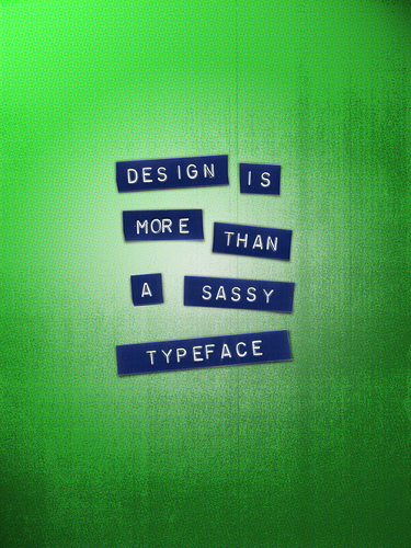
 |
| This one may be my favorite of the series |
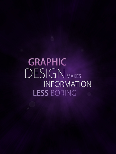
 |
| Sassy, Nicole, sassy! |
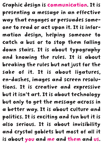
 |
| Great message |
 |
| A bit wordy, but a great use of color. |
 |
| I think I like the message better than the design, ironically. I've had to learn that just because you can do something with design, doesn't always mean you should do it. |
Oh, and while I'm on the topic of graphic design in general, try and get your hands on a copy of this book:
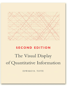 |
| Absolutely love it, and learned so much from it. |
On Graphic Design in Mapping
I've been thinking a lot about how to best design my maps. I came across a reading in the fonts section of our textbooks that laid out some basic rules: serif font to be used for proper names, like "Idaho" or "Harrisburg", sans serif font to be used for natural features, like "Susquehanna River" or "Appalachian Mountains" (Making Maps, pg. 240). At first I was delighted. In a world of rules, all I have to do is learn all the rules and Everything Will Be Perfect! Eventually, however, my delight faded to a sort of resentment. Who the hell are (checks book) John Krygier and Denis Wood to tell me how to make my maps? So what, so Krygier was a president of the North American Cartographic Information Society, and Wood has written another book on mapping? Okay, so it turns out that yeah, they know their stuff.
So now I have to wonder-- when do you break rules? I'm starting to think of rules not so much as rules and more as conventions. We are used to seeing the Pacific Ocean symbolized blue. (Making Maps, pg. 266) It would be flat-out bizarre to symbolize it as red. (Perhaps the Red Sea could be red?... No. Still want to do it.) We are used to a north-up projection. It would be unusual to throw in, say, a dymaxion projection into the mix.
However, there's a time and a place to break rules, or break conventions, as the case may be. I'm starting to think that conventions should only really be broken to make a point, like that there is no true correct orientation, or that water isn't always blue.
So now I have to wonder-- when do you break rules? I'm starting to think of rules not so much as rules and more as conventions. We are used to seeing the Pacific Ocean symbolized blue. (Making Maps, pg. 266) It would be flat-out bizarre to symbolize it as red. (Perhaps the Red Sea could be red?... No. Still want to do it.) We are used to a north-up projection. It would be unusual to throw in, say, a dymaxion projection into the mix.
 |
| "Buckminster Fuller" was an answer on Jeopardy! this week to a question about map projection. I about peed myself. |
 |
| The Mighty Susquehanna, known for a lot of tannins. |
Sunday, September 26, 2010
Fun with Stereotypes!
I found some hilarious stereotype maps on a design blog called "Mapping Stereotypes" by Yanko Tsvetkov, specifically, Europe as seen from various points of view. Obviously, these are not meant to be taken seriously. (FlowingData actually described these as "stereotypes of stereotypes" which captures these pretty well.) Enjoy and have a good laugh... we're probably all a little frazzled from hastily compiling our Yellowstone projects (no, of course, Nicole, we've all been done for weeks now!). As always, click to enlarge-- you will need to do so in order to read some of the smaller captions.
Europe According to the US:

I for one, cannot wait to tell my best friend in Bosnia that she is labelled "Resident Evil".
Europe from the UK perspective:

Europe According to the US:

I for one, cannot wait to tell my best friend in Bosnia that she is labelled "Resident Evil".
Europe from the UK perspective:

Finally, God help us all, Europe as seen by Gay Men:
 |
| Solely because the label of Italy as "Straight Homos" made me literally laugh out loud. |
Along similar lines, I also found a really funny youtube video depicting Europe as seen by Estonians. The crude illustration style and faux-amateur narration really only makes it funnier. I don't want to say anything else, and spoil any punchlines. Have a look.
Saturday, September 25, 2010
The Psychology of Cartography
Since embarking on my GIS studies, I have encountered a number of map enthusiast websites (StrangeMaps, FlowingData, MapOfStrange) as well as map-enthusiast books (just bought this one, and really enjoying it), and have found that my own nascent map-geekery consciousness has been awakened. I always had a sort of fondness for maps (not to mention an eerie ability to fold them properly, and an associated contempt for those who can/do not), which has become a full-blown mania. Finding a number of people who are self-described "map geeks" has made me wonder about the psychological effect of maps.
I find that in myself-- and I cannot, at least in this regard, believe that I am unique-- the presence of maps results in a sense of comfort, of control, of protection from the Unknown. Maps allow us to become godlike, to view the whole of our landscape from a dispassionate birds-eye perspective, above the fray, above the struggle and morass of crowded cities and hostile wilderness alike. Even the terrifying creatures depicted on the edges of the map (Here be dragons!) suggest by comparison that safety is augured within the plotted territory. The only true danger lies in the unexplored realms.
Following a rather painful series of trials in my life, some years ago, I found myself coping by becoming immersed in mathematics, specifically actuarial statistics, a far cry from the artistic world in which I had been involved. If I could only reduce life's passions, tribulations, and tragedies to discrete points of data, if I could reduce that data to an equation, maybe I could find a sort of balance in chaos. Of course, it was a fool's errand, if an enjoyable one. Now I find myself immersed in a world of maps, of cartography, of dispassionate analysis. While I was brought to this program by the sensible notion of learning a marketable skill, I have to wonder if I am also attempting to once again find reason and order within the uncharted. Are indeed, we all-- do cartographers think of themselves as somehow lost?
I find that in myself-- and I cannot, at least in this regard, believe that I am unique-- the presence of maps results in a sense of comfort, of control, of protection from the Unknown. Maps allow us to become godlike, to view the whole of our landscape from a dispassionate birds-eye perspective, above the fray, above the struggle and morass of crowded cities and hostile wilderness alike. Even the terrifying creatures depicted on the edges of the map (Here be dragons!) suggest by comparison that safety is augured within the plotted territory. The only true danger lies in the unexplored realms.
 |
| We all know, things only really went bad once Mike threw away the map. This country girl, for one, was more upset that they crossed the stream, and did not follow it. |
Following a rather painful series of trials in my life, some years ago, I found myself coping by becoming immersed in mathematics, specifically actuarial statistics, a far cry from the artistic world in which I had been involved. If I could only reduce life's passions, tribulations, and tragedies to discrete points of data, if I could reduce that data to an equation, maybe I could find a sort of balance in chaos. Of course, it was a fool's errand, if an enjoyable one. Now I find myself immersed in a world of maps, of cartography, of dispassionate analysis. While I was brought to this program by the sensible notion of learning a marketable skill, I have to wonder if I am also attempting to once again find reason and order within the uncharted. Are indeed, we all-- do cartographers think of themselves as somehow lost?
Sunday, September 19, 2010
Maps, Bias, South America, and Buckminster Fuller
The cover of this week's issue of The Economist Magazine features a story on Latin America with the title "Nobody's Backyard". The cover illustration is an upside-down map, centered on South and Central America:
 |
| From economist.com, click to enlarge |
I've always enjoyed these types of (to a northern-centric audience) unconventional maps, starting from when I was in middle school and a teacher showed us an upside-down map. At first it felt "wrong" but the older I got, the more I realized there is no "right", only bias. As annoying as it is, it's important and correct to analyse one's own biases in order to seek greater truth. "North" is, once you think about it, a type of bias. "North" only applies on Earth, and each separate sphere has its own "north", governed by its own magnetic field. And the fact that the most of the major planets (minus Pluto, of course, and Uranus, which has a tipped axis) in our own solar system share a more-or-less similar orientation of magnetic north is less to do with any sort of "right" or "correct" way and more to do with the fact that we all coalesced from the same sort of spinning plate of matter. The direction of the spin transferred to the spin of each planet which in turn produces a magnetic field.
 |
| Science! |
ahem.
I thought I was pretty damn clever for my musings on the agreed-upon fiction of a "north" (much like our agreed-upon fiction of "the value of cash") until I found out that Buckminster Fuller felt the same way, and so devised his own projection called a dymaxion map. The important thing to note here is that there is no "correct orientation". Rad.
 |
| taken from this site, click to enlarge |
That said, I shouldn't be surprised that Buckminster Fuller would have done such a thing. He's fantastic. He's forward thinking.
 |
| we wear the same glasses! |
Getting back to the original point of this post, that is, using an unconventional map to subvert cultural bias, not only is South America marginalized, as it were, by the typical use of a north-up projection, but it is also marginalized by use of a standard Mercator projection. The same map that we all stared at as schoolchildren, gaining a perspective on the world outside of central PA, as pointed out in our textbook, is well-known for exaggerating land mass the further from the equator one travels. Since most land mass in the northern hemisphere is massed higher up on the globe ('higher up'? see-- I just did it!) and most land mass on the southern hemisphere is closer to the equator, a Mercator projection bulks up the north at the expense of the south. Maybe this wouldn't be such a big deal if the history of Latin America didn't contain so many examples of Northern/European colonial oppression. I'm not sure if the artistic editors of the Economist really took 1) the shape of the earth, 2) the distortion of typical projections, 3) the colonial history of South and Central America, and 4) Buckminster Fuller and Hilary Swank, into account when they set this cover for "Nobody's Backyard" but it certainly seems to have been a canny decision.
On the same stroll through my bookstore, I came upon another (!!) fantastic South-American themed design:
 |
| published by Bloomsbury |
At first, I saw it only as a clever use of color and text... then a second later realized that the text itself was creating the shape of the map. I have seen this design style used before in Latin American-themed texts. I don't know if this is solely a feature of the convenient shape of the countries for text filling, or if it is more a feature of so many great Latin American authors being also politically active and controversial (Borges, Neruda, etc.). A great deal of Latin American literature and poetry (at least, the texts to which I, a Northerner, have been exposed) deal with cultural oppression and simultaneous rebirth and subsequent self-identity.
And here, solely because I love Pablo Neruda, is an excerpt from one of my favorite poems in The Captain's Verses, Tu Risa/ Your Laughter (Donald Walsh translation).
|
|
Subscribe to:
Posts (Atom)