As much as I enjoy the analysis, nuts-and-bolts elements of GIS, I also enjoy the artistic, visual elements of cartographic design, and much of what we are studying this semester deals with issues of visual hierarchy, appropriateness of data visualisation, and simply telling the story of your data or landscape, as the case may be. My friend Josette linked a great website on her facebook page this morning;
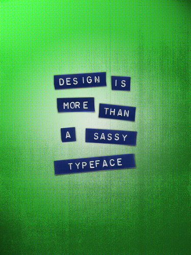
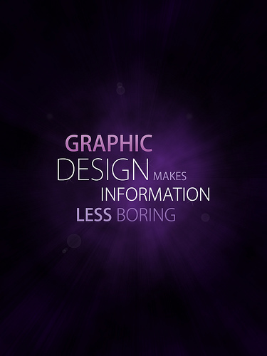
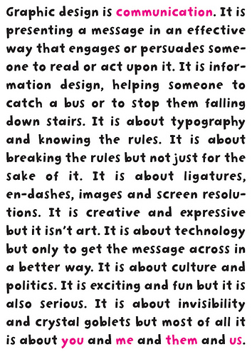
fifty graphic designers use posters to illustrate "What is Graphic Design". Although the site deals with general graphic design, we as cartographers can certainly learn a great deal from these as well. At the end of the day, conveying information visually and elegantly is what we should strive for. Below are a few of my favorite posters.
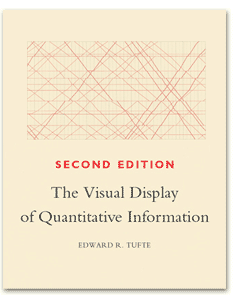
Oh, and while I'm on the topic of graphic design in general, try and get your hands on a copy of this book:
You'll be glad you read it.


No comments:
Post a Comment