 |
| Here is my map for the Olympic assignment, click to enlarge |
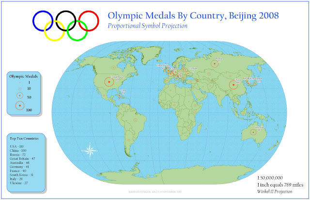
Well. We were given the assignment to make a map using a proportional symbol scheme to show which countries won the most Olympic medals at the Beijing 2008 games. Simple enough. Almost too simple. I have to say, I am not crazy about my map. I kind of phoned this one in. And don't worry, I would also tell that to my professor (who, BTW, reads our blogs) so this is not something I would not say in class. My map is okay. But merely okay. It is not superlative. However, I have been sick as a dog this week (I even missed class, which by and large Does Not Happen) and this was the best effort I could muster. I then went home and slept for ten hours.
So. Why all the bitching? Well, I've decided to present this as a post-mortem, and to detail what went wrong and what could have been better. Including one detail that I will attempt to fix really fast before class. Really fast.
What I don't like:
- My medal symbol. I attempted to import a really nifty image:
 |
| Click to enlarge, here is the original |
But I had to take it into GIMP and remove the background (which took goddamn forever), and then when I imported into ArcGIS as a PNG for some damn reason, I wound up with a pixelated, yellow-toned, piece of crap. Eventually I said F--- This and decided to make my own damn symbol, even if it looked less awesome. So I made a hollow circle to have a sense of openness in the event of overlap but with a center dot to give a notion of placement, so that you wouldn't think that say, Austria's symbol was over Hungary. I chose orange because... it showed up nicely.
Wow. There is a lot of damn white on that map. I would have liked to tone it down by giving it a slightly toned background, like a beigey shade... But my Olympic ring symbol, which I de-backgrounded in PP, decided to import in with a damn white background. I decided that I couldn't deal with the sinus headache anymore, and just kept a white background.
The text in the bottom right should be smaller. I honestly had trouble keeping track of the actual size of my text, as this map is drafted to be 22x34. I may touch that up before class. Maybe.
The north arrow does not curve into the side of the earth. I just stuck it there. Hrm.
The projection (Winkel II: The Quickening) that I chose I liked initially for the pleasing shape that it gave the Earth. However, looking at my map, I feel like my data is sort of not front and center. Does my viewer have to squint and sort out which are the top medal winners? I almost feel I should have chosen a scheme that unfairly emphasized the Northern Hemisphere to hype up my data. Sorry, Southern Hemisphere. First colonialism and now this.
Hey! Let's all look at Antarctica! There sure is a lot of it, doing f---ing nothing and taking up valuable real estate.
So I inserted a little box to show the top 10 medal winners. Pretty much because my map is really bare and dull. And later, when I look at my map, I think, where the hell is Germany? Oh, GD ArcGIS ate my label with an overlap. While I'm sure the French are glad to have some payback for WWII, I'm not too happy about my label. I'm going to try and fix that Monday.
I made the dick move of deciding to only label countries that scored in excess of 20 medals, in the interest of not cluttering my map. My apologies to Africa, South America, and Oceania. Oh, and to Palau, partly because of my map but mostly because of global warming.
The projection is a little silly, in the way that all projections are silly, because it is inherently false while attempting to be realistic. Sure, let's be all forward thinking and project the world in a round-ish shape... and then be all fake and cram all the continents to the front in a way that, God willing, they will never be. Looking at the earth that way reminds me of the way actors sit at a table in a television show or staged play, all crammed together but avoiding one side, in order to all be visible to the audience at once. Real people don't eat dinner that way. Real continents don't look that way. But, well, artifice it is.
***************UPDATE************************
It's twenty minutes to class. I came in early and fixed/triaged my map. Here it is. Of course, I sit next to Foram and am in despair at seeing how f---ing awesome her map is. Well. My map is below.
 |
| well, it's done, anyway. |


No comments:
Post a Comment