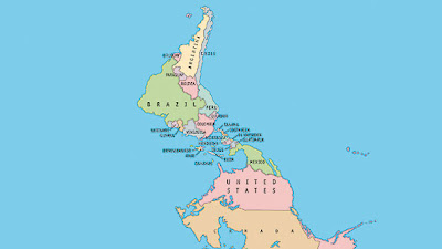
The cover of this week's issue of The Economist Magazine features a story on Latin America with the title "Nobody's Backyard". The cover illustration is an upside-down map, centered on South and Central America:
 |
| From economist.com, click to enlarge |
I've always enjoyed these types of (to a northern-centric audience) unconventional maps, starting from when I was in middle school and a teacher showed us an upside-down map. At first it felt "wrong" but the older I got, the more I realized there is no "right", only bias. As annoying as it is, it's important and correct to analyse one's own biases in order to seek greater truth. "North" is, once you think about it, a type of bias. "North" only applies on Earth, and each separate sphere has its own "north", governed by its own magnetic field. And the fact that the most of the major planets (minus Pluto, of course, and Uranus, which has a tipped axis) in our own solar system share a more-or-less similar orientation of magnetic north is less to do with any sort of "right" or "correct" way and more to do with the fact that we all coalesced from the same sort of spinning plate of matter. The direction of the spin transferred to the spin of each planet which in turn produces a magnetic field.
ahem.
I thought I was pretty damn clever for my musings on the agreed-upon fiction of a "north" (much like our agreed-upon fiction of "the value of cash") until I found out that Buckminster Fuller felt the same way, and so devised his own projection called a dymaxion map. The important thing to note here is that there is no "correct orientation". Rad.
That said, I shouldn't be surprised that Buckminster Fuller would have done such a thing. He's fantastic. He's forward thinking.
Getting back to the original point of this post, that is, using an unconventional map to subvert cultural bias, not only is South America marginalized, as it were, by the typical use of a north-up projection, but it is also marginalized by use of a standard Mercator projection. The same map that we all stared at as schoolchildren, gaining a perspective on the world outside of central PA, as pointed out in our textbook, is well-known for exaggerating land mass the further from the equator one travels. Since most land mass in the northern hemisphere is massed higher up on the globe ('higher up'? see-- I just did it!) and most land mass on the southern hemisphere is closer to the equator, a Mercator projection bulks up the north at the expense of the south. Maybe this wouldn't be such a big deal if the history of Latin America didn't contain so many examples of Northern/European colonial oppression. I'm not sure if the artistic editors of the Economist really took 1) the shape of the earth, 2) the distortion of typical projections, 3) the colonial history of South and Central America, and 4) Buckminster Fuller and Hilary Swank, into account when they set this cover for "Nobody's Backyard" but it certainly seems to have been a canny decision.
On the same stroll through my bookstore, I came upon another (!!) fantastic South-American themed design:
At first, I saw it only as a clever use of color and text... then a second later realized that the text itself was creating the shape of the map. I have seen this design style used before in Latin American-themed texts. I don't know if this is solely a feature of the convenient shape of the countries for text filling, or if it is more a feature of so many great Latin American authors being also politically active and controversial (Borges, Neruda, etc.). A great deal of Latin American literature and poetry (at least, the texts to which I, a Northerner, have been exposed) deal with cultural oppression and simultaneous rebirth and subsequent self-identity.
And here, solely because I love Pablo Neruda, is an excerpt from one of my favorite poems in The Captain's Verses, Tu Risa/ Your Laughter (Donald Walsh translation).
| Ríete de la noche, |
| del día, de la luna, |
| ríete de las calles |
| torcidas de la isla, |
| ríete de este torpe |
| muchacho que te quiere, |
| pero cuando yo abro |
| los ojos y los cierro, |
| cuando mis pasos van, |
| cuando vuelven mis pasos, |
| niégame el pan, el aire, |
| la luz, la primavera, |
| pero tu risa nunca |
| porque me moriría. |
|
| Laugh at the night, |
| at the day, at the moon, |
| laugh at the twisted |
| streets of the island, |
| laugh at this clumsy |
| boy who loves you, |
| but when I open |
| my eyes and close them, |
| when my steps go, |
| when my steps return, |
| deny me bread, air, |
| light, spring, |
| but never your laughter |
| for I would die. |
|


Back in the 1970's when I was a student at Kenmore East Sr. High School, my Chem. teacher, John Izard, kept a globe of the world on his desk which he had inverted so that Antarctica was on top. When someone would tell him, "Your globe is upside down," he would reply with something like, "How can you tell?" or "There is no UP in outer space. I found this humorous, but I got the broader point. Much later, in the early 1990's, I found a comic book printed by a small independent press. I think I still have it somewhere. The first few pages of this comic featured inverted images. The frames progressed from upper left to lower right as they normally would; the text was right side up--only the pictures themselves were upside down. A page or so in, it became clear that this was to reflect that the story took place in Australia. When the action moved to the United States, the pictures were right side up. The point of course, was the same. I guess if we want to escape our own prejudices, we need to take a step back from ourselves and get a little bit out of our own heads.
ReplyDeleteIt's been about a thousand years, but I have to say, good contribution, Larry.
ReplyDelete